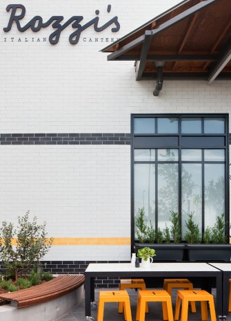
Rozzi's Italian Canteen

name: Rozzi's Italian Canteen
Location: Melbourne, Australia
Design: mim


Rozzi's is an italian eatery with a focus on fresh, modern cuisine. The interior of the space reflects the menu and features a modern, and vibrant interior. 


Utilizing a limited color and material palate allows the space to come together easily while the added typography and wording adds an additional creative element.
I love the use of concrete tiles to tie the yellow and grey through the space while the addition of bookcases adds a homey element emphasizing the desire for diners to feel at ease within the space. 


The use of subway tiles and wood all keeps the space on trend and hip but I love that they added a few new elements to make the space truly unique and fresh.


All images via mim design & yellowtrace

King + Duke

Name: King + Duke
Location: Atlanta, GA
Design: Meyer Davis Studio


Recently opened in Atlanta, King + Duke is the the fourth restaurant in Ford Fry's restaurant family. Playing off of the novel 'Adventures of Huckleberry Finn' the restaurant is deceptively casual and relaxed and features early American cooking techniques and rustic cuisine. 


Throughout the space a mix of rustic and refined materials work together to create a curated and timeworn interior. 


The large circular booths and light wood add contemporary elements while the leather accents and wood paneled walls bring in a rustic element to balance it out. 


Photos © Sarah Dodge via Eater ATL

Local Favorite; Parson's Chicken & Fish

Name: Parson's Chicken & Fish
Location: Chicago, IL
Design: Land & Sea Dept


As a modern take on the classic neighborhood joint, Parson's created a vibrant and fun space that utilizes color, geometric shapes, and clean lines. 


Located in a classic 70's era building, Parson's plays up the vintage vibe using a minimalist color palate of red, white, and blonde wood. Utilizing the red geometric pattern throughout the space (from the warfront to the packaging) crates cohesion within the space. Both color and pattern create a big visual impact for a small investment. 


The 283 person patio is outfitted with picnic tables and striped umbrellas and easily makes up for the large U-shaped community booths inside which while maximizing seating, minimize options for the smaller sized groups. 

Head over and experience the patio and fried chicken on the next warm summer day in Chicago.


All photos © Clayton Hauck via Weheart

Chez Dré

Name: Chez Dré
Location: South Melbourne, Australia
Photography: Erika Hildegard 


Located down an inconspicuous-looking alley in South Melbourne lies a boulangerie and patisserie. Melbourne based photographer, Erika Hildegard, recently sent us some lovely photographs of their space and we couldn't wait to share. 


Located in a former warehouse, the space still manages to feel warm and inviting with industrial nods. 


Designed as a lab, where pastry chef Andrea Reiss could play with flavors and combinations, the space retains the lab-like quality by keeping the shell of the building minimal and placing emphasis on displays and service areas. 


The touch of green throughout the space adds energy and vibrancy to the otherwise neutral palate and the wood tables, chairs, and coffee bar top all add a touch of rustic warmth. 


One of my favorite aspects of the space is their use of seating groups and space planing to create various intimate moments within such a large space. 


 All photos © Erika Hildegard

Our Work; Dryhop Brewers

Name: Dryhop Brewers
Location; Chicago, IL
Designer: Kaper Design, LLC
Scope of Work: Schematic Design, Design Development, Feasibility studies, Contract Administration,  FF&E Sourcing


Kaper Design, LLC is proud to announce the opening of Dryhop Brewers. A warm and comfortable space, our design showcases the craft of creating. With an initial concept given by the owner of 'My father's workshop on a good day.', Kaper Design created a space that played homage to the craftsmen and their crafts. Highlighting the woodworking and beer making crafts simultaneously was an exciting challenge and allowed us to get creative with materials and applications. 


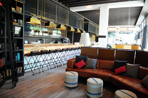
The 50 foot long bar was designed by local carpenter Kevin Hughes and was based off our drawings depicting a stack of lumber. On top of the bar lies a live-edged slab sourced from a single, lightening-struck tree which was urban forested from just miles outside of Chicago. 


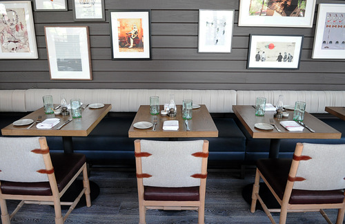
The tables were crafted specifically for Dryhop and feature white oak butcher block tops and cold-welded steel bases designed by us to be simplistic and unobtrusive. While our bar height tables feature steel bases showcasing a modern interpretation of a saw horse. 


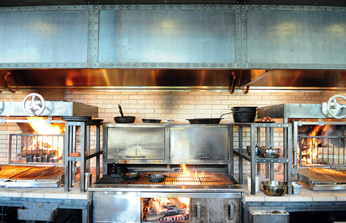
Dryhop Brewers space consists of multiple spaces designed to showcase the brewing process. With custom steel and glass partition walls and black subway tile, both the brewhouse and fermentation room showcase the equipment within and highlight the process behind their great beer.


Both mens and women's restrooms continue to highlight craftsmen and their craft. Creating a custom wall mural using historic and technical images of the brewing process, history of brewing, and woodworking allowed us to tie these rooms into the overall feel of the brewery and make the diners experience a complete visit. Bathrooms are rounded out with industrial light fixtures, wood framed mirrors and penny tile floors.


Stop by for a beer and some delicious food the next time you are in Chicago!

Local favorite; The Purple Pig

Name: The Purple Pig
Location: Chicago, IL


The Purple Pig is easily one of my favorite dining spots in the city. With an intimate and warm space, great wine list, and fun menu it easily fits the bill for just about any occasion. Even with an hour average wait time (every day, all year long…), The Purple Pig is the restaurant we frequent the most often and the place we are most likely to take visitors.


With an extremely small space, seating was maximized by using long community table in the middle of the space. Paired with a few two and four tops (and the outdoor patio in the summer.) allows them to accommodate almost any size group and helps turn over tables relatively quickly and efficiently.  

The spanish tiles add a bit of playfulness to the space while the wine barrels and art work all play on the literal side of their motto 'Cheese, Wine, & Swine'.


The Riding House Cafe

Name: The Riding House Cafe
Location: London
Architect: Lou Davis


Classic style lovingly pairs with vintage wares at The Riding House Cafe. Repurposed theater chairs, industrial accents, and rich wood layer together to create a warm and welcoming space.


The pop of blue found on the barstools and tile border add a refreshing contrast to the warm wood and industrial accents.


Industrial open shelving located at the kitchen pass and behind the bar add enough weight to provide visual separation while still allowing light and sight lines into the spaces.


Curated chotchkies; one of the very few examples of this done well within a restaurant space due to it's restricted nature.


Local Favorite: Bow Truss

Name: Bow Truss
Location: Chicago, IL


With NeoCon just around the corner, I wanted to give all those headed into town a look at one of my favorite coffee shops near the Mart.

Bow Truss is a local, small batch roaster with two locations in Chicago. While both serve amazing coffee, their newest location in River North is the stand out in terms of design. 


A smaller space than their original, the River North location still maintains the rustic, reclaimed, and hip nature the original East Lakeview location is known for but does it a more thoughtful and concentrated manor. 


Images © Zagat, Doejo

The General Muir

Name: The General Muir
Location: Atlanta, GA
Design: Square Feet Studio; http://www.squarefeetstudio.com


As a modern take on a Jewish deli, the interior of The General Muir looks just as appetizing as the food. With classic details like subway tiles and checkerboard floors, the space feels rooted in tradition while still keeping a firm grasp on the dining pulse.


Keeping the color palate restricted helps keep the interior feeling modern while the bronze details help add a classically aged note. The marble toped bar, vintage inspired bar stools, and globe lights all work together to create layers within the space. 


All images © Eater Atlanta

Moustache Milk + Cookie Bar

Name: Moustache Milk + Cookie Bar
Location: Auckland, NZ


 While literal, the milk bottle light fixture sums up and drives home the concept. Keeping all of the interior fittings and furnishings very modular helps create untidy within the small space while still allowing a small amount of seating.


A fun break from the normal, Moustache Milk & Cookie Bar has created a playful interior filled with colorful notes.


Images © Architecturenow