Riffle NW

Name: Riffle NW
Location: Portland, OR


A well thought through concept is one where the restaurant owners consider all components of a guests' meal. From entry and exterior vantages, graphic design, and interior design, all the way to tableware, servers outfits, and take away, all components add up to create a cohesive concept. Riffle NW is a great example of a restaurant thinking through executing each of these components extremely well, providing a completely cohesive dining experience.


The nautical nature of Riffle's space blends perfectly with the raw bar and seafood heavy menu being served. 


The light wood, sail cloth seating and dividers, and numerical table graphics all play off each other to create a comfortable and bright space that reflects the nautical nature but doesn't overdo it.


Sticking to the turquoise and orange color scheme in their graphic and identity design tie into the colors used with the space once again adding another level of cohesion to the dining experience.


The drink menus are cleverly hidden away and remind me of pulling up a trap to discover what you've caught. 


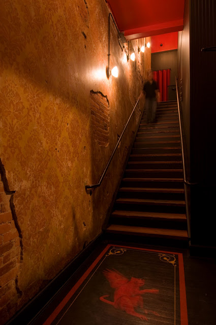
Image 2-3, 5 © Eater Portland
Image 1, 4, 6-8  @ Behance

A Concept Divided; Origo

Name: Origo
Location: Bucharest, Romania
Design: Lama Architectura


A trend I've been watching for a while now is duel-concepts under a single roof. If done well, they can offer the owner maximum ROI, attract a larger demographic, and merge interests. Origo, in Romania has done just this by splitting their space and concept by time; coffee shop in the morning, cocktail bar at night. 


Keeping the space minimal allows for both concepts to operate within the space space, utilizing the same fixtures and furnishings. A heavy handed use of wood and raw metal are contrasted by cups and saucers artfully displayed from the ceiling. Once again proving the benefit of repetition with a everyday object.  By keeping all art limited to the cup/saucer installation, it allows the space to remain focused and draws the users eye up to the original beam ceiling uncovered during construction.


Maximizing seating using bar height and banquette styles also keeps the space open and draws the eye through the space, downplaying its lack of width and focusing on its exaggerated length.


All photos © We Heart


Fonda

Name: Fonda Mexican
Location: Melbourne, Australia
Design: Techne Architects


Fonda Mexican's second location showcases a great example of a modern, vibrant interior utilizing texture and a minimalist color palate.


The modern and clean lines of the existing structure translate well to the the rest of the space and add an element of vibrancy and excitement. Juxtaposed with just a few rustic touches throughout *wood countertops and bar front primarily) adds just enough balance to warm up the primarily white space. 

All images © Weheart

Hock Farms

Name: Hock Farms
Location: Sacremento, CA
Design: Beta Form Industries


Hock Farms is a bright & slightly modern space that still captures a bit of rustic warmth within it's walls.


The added brick gives the interior some texture while painting it white does a great job at brightening the space. 


I love the rustic details and texture of fabrics used as they layer multiple styles allowing the space to feel inviting and comfortable.


The pop of blue in the center of the space is a welcome break from the monochrome interior and adds a bit of definition among seating groups.


All photos © Kat Alves via Remodelista

Wee Jeanie

Name: Wee Jeanie
Location: Melbourne, Australia
Photos: Erika Hildegard Photography


Located close to the Yarraville train station, Wee Jeanie is a great spot to grab your morning coffee. 


The interior is bright and classic with minimal details and allows you to feel as if you are sitting in your own kitchen, sunshine streaming through the windows. 


The exposed, worn brick adds a touch of warmth to the otherwise white space while the stacked bond tile add a slight modern touch.


I love the bright back patio and how they bridged the interior and exterior with a leaning edge on both sides. The acrylic table top and wood truss base also point the subtle modern/rustic mix happening throughout the space.


Mighty Quinn's

Name: Mighty Quinn's
Location: New York, NY


Mighty Quinn's has taken barbecue into a new realm in NYC; allowing great products in a great atmosphere while still keeping quick service. The monochromatic palate and limited material usage allows for a cohesive and simple space that still feels on trend.


The reclaimed wood tables were created from salvaged wood from The Puck building in downtown NYC and add a level of warmth to the space. Balancing the wood with metal and gray keeps the space relevant and timeless. 


All images © Eater NY

James Beard Awards 2013


Just like many others in the food industry, May 6th was spent live streaming & refreshing every social media outlet to get the play by play of the annual James Beard Awards!

While many were awarded, we are always more interested in those that deliver the full package;  great chef, great food, and well designed spaces. Take a look at a few of our favorite winners, after the jump.


*For additional photos, click the photos below.

Best Restaurant Design- under 75 seats
Name: Isa
Location: New York
Design: Taavo Somer


Best Chef in America; Midwest
Name: Stephanie Izard
Restaurant: Girl & the Goat/ Little Goat Bread


Best New Restaurant
Name: State Bird Provisions
Location: San Francisco, CA


Outstanding Chef
Name: Paul Kahan
Restaurants: Blackbird/ Avec/ Publican/ PQM


Manzanilla

Name: Manzanilla
Location: New York
Design: Meyer Davis


Manzanilla is a Spanish brasserie that creates an intimate environment within its large space.


The chevron tiled floors and warm wood ceiling tie the space together while the multiple seating groups  minimize the impact of the large space.


The attention to detail and contrast of warm and cool materials creates a space appears balanced and energized.


Images 1-3 © Thrillist
Image 4, 5 © Eater NY

Spuntino

Name: Spuntino
Location: London


I love the warm, grittiness of Spuntino and enjoy the small scale and intimacy.


Working with the exposed brick, worn subway tiles, and raw nature of the space allows the furnishings and fixtures to be kept simple and unassuming while maintaining the character and rustic nature of the interior.


Image 1 © Pursuitist
Image 2- 4 © Google Image 

Black Jack

Name: Black Jack
Location: Washington, D.C.
Design: CoreDC


While in DC last week, I had the opportunity to visit Black Jack, located just above Pearl Dive Oyster Bar on 14th street. The attention to detail and reigned in circus theme created a great bar environment that felt fun, but not over the top.


With the front of the space dedicated to a sideshow, circus-esq concept, the back of the space personally stole the show. A full bocce court, old bleacher seating, and barstools created a fun and unique bar experience.


Keeping the color palate reigned in and using images of sideshow acts, helped keep the theme from being over the top while still allowing for key features of traditional circuses like red velvet curtains, draped string lights, and hand painted bar details. 


Images © CoreDC