Bukowski Grill

Name: Bukowski Grill
Location: London, UK


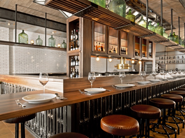
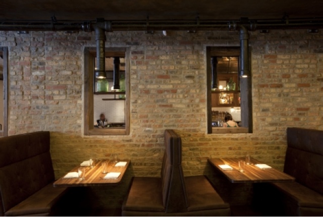
Located in a retrofitted shipping container, Bukowski Grill is a pop-up burger shop with some great details.


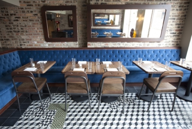
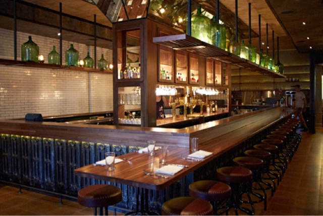
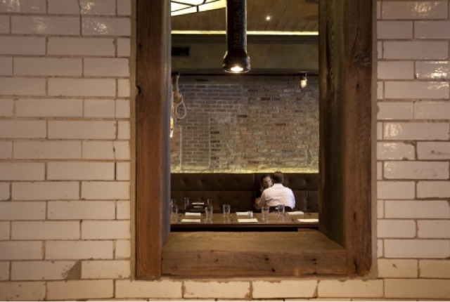
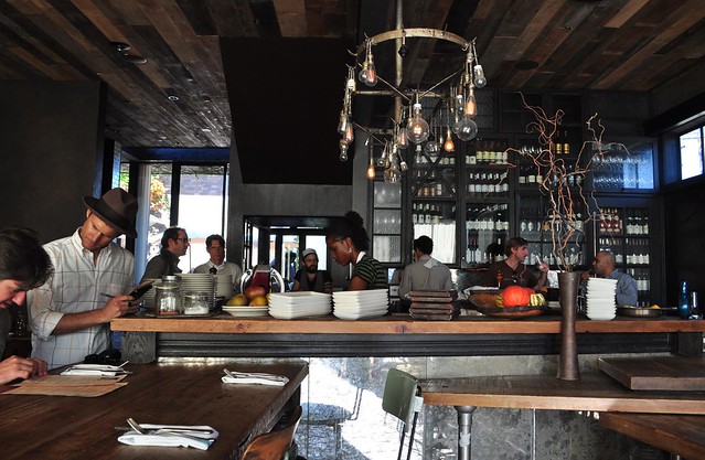
The main material used throughout the small space is varying tones and species of wood, which contrasts well to the metal exterior. The interior manages a slight diner feel with hints of industrial thrown throughout. 


While small, the linear layout and perpendicular booths utilize space well to maintain an intimate and warm interior.
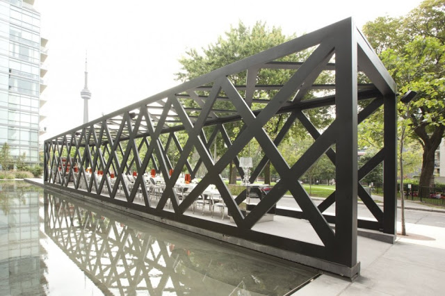
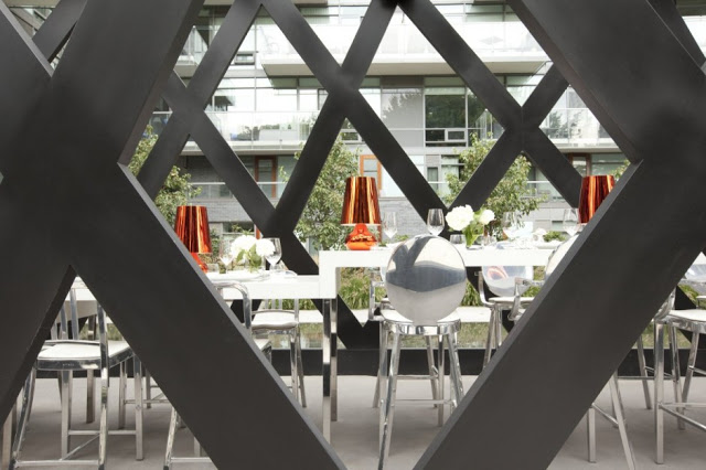
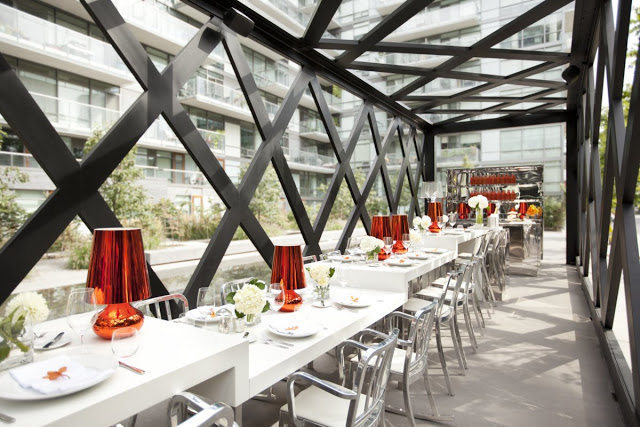
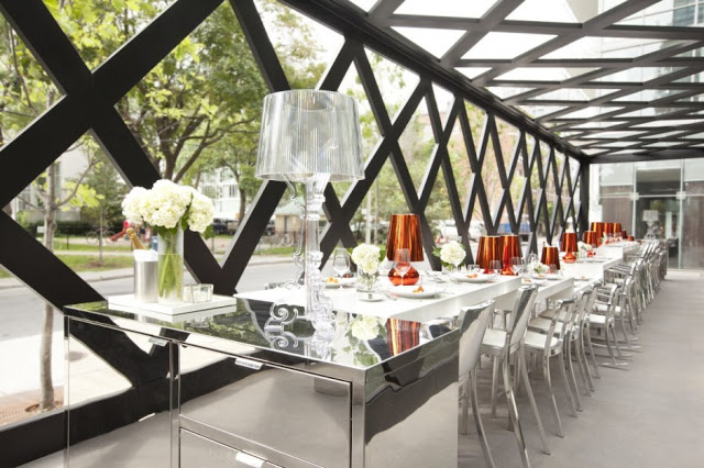


The Old Library

Name: The Old Library
Location: Cronulla, Australia
Design: Hecker Guthrie


Scandinavian simplicity meets the sharp angles of a traditional church structure in The Old Library. With the simple material palate of light wood, white walls, black and white chairs and glass greenhouse-like structure, the Scandinavian aesthetic is easily apparent. 


The interior greenhouse-like structure helps emphasize the sharp lines and angles of the structure while providing a visual break in the long, linear layout.


The interior provides moments for intimate dining and drinks while still maintaining the connection to the other spaces.


All images © The Old Library

Pan Pan Atelier

Name: Pan Pan Atelier
Location: Valencia, Spain

Pan Pan Atelier was designed based around a 'modern interpretation of the traditional ear of wheat'. Everything from the colors to the herringbone texture & pattern all directly tie back to that original idea. I enjoy that Pan Pan took this concept and idea and translated it not only into their branding and identity but into their cafe space as well. 


Carrying on the golden and white hues and the pattern throughout the space unifies the concept and
carries the message throughout the guests full experience.


All photos © Behance


Catalina Fernández

Name: Catalina Fernández
Location: San Pedro, Mexico


There is something so compelling about a simple, well though out concept. Branding and design truly go hand-in-hand and Catalina Fernandez Pastry boutique is a great example of this.


With a bold, yet simple color story and modern details, the entire space carries an urban and modern aesthetic. 


The repetition of items, in this case painted white, is a strong visual and adds to the overall texture of the space.


By keeping the interior simple and clean, it allows their brand and pastries to be on center stage. 

All photos © Yatzer 

Scarpetta Dining Pavilion

Name: Scarpetta Dining Pavilion
Location: Toronto, Canada
Design: gh3, II by IV Design

New York based restaurant, Scarpetta, recently completed it's first international expansion into the city of Toronto. Wishing to create a new dining concept where guests can 'see and be seen', the dining pavilion surely accomplishes it's directives.


New York based restaurant, Scarpetta, recently completed it's first international expansion into the city of Toronto. Wishing to create a new dining concept where guests can 'see and be seen', the dining pavilion surely accomplishes it's directives.


Set alongside a park and parallel to a linear reflecting pool, the angular and narrow pergola has one central community table dominating the space. 
The long table was designed to include seating ranging from standard dining, counter, and bar height spots by raising or lowering the Corian surface.


The reflective nature of the inside finishes brings the natural qualities found outside, inside and allows a harmonious space throughout. Placing the bar stations perpendicular to the direction of the space, creates a natural break and defines the spaces boundaries.


All photos © Dan couto via Contemporist


Local Favorite; Butcher & the Burger

Name: Butcher & the Burger
Location: Chicago, IL

One of the great things about the Chicago food scene is that you truly can create anything, and have it be successful as long as you stick to a concept. Butcher & the Burger did just that and created a great local burger spot in the process. Focused on made-to-order, custom burgers (think grass-fed, salmon, bison, etc.) and thick cut Kennebec fries, the local burger joint is also a butcher shop and classroom of sorts giving hands-on butcher & cooking experience to anyone interested.

b%26b.jpeg

The interior is a great mix of industrial and traditional Chicago. Exposed brick walls, industrial stools & fittings, antiques from old butcher shops, and hand-cut Carrara marble subway tiles help create a blend of high & low. 

Butcher and the Burger

With a traditional Chicago row-house space, seating was maximized with stools that swing out from under the metal & pipe bar. 


Image 1-2 © Timeout Chicago
Image 3 © LTH Forum
Image 4-5 © Google+


The Trencherman

Name: The Trencherman
Location: Chicago, IL
Design: Kevin Heisner


One of the newest restaurants to pop up here in Chicago is The Trencherman. With vintage details, rich woods, and some surprising pops of color, the space is one I'm excited to try out. I love the utilization of the pipes above the booths for lighting and the bar extending beyond, creating a table of sorts built-it. The pop is blue found in the seating area on the upper level, is separated enough for it to define the space while also providing a bit of a transition from the entry to the main dining space.


Gjelina

Name: Gjelina
Location: Venice, CA
Design: Modern Arc


Here is another great, industrial restaurant space. Located in Venice California, Gjelina mastered the rustic, glamourous,slightly modern, and industrial feeling. The interior is paired with some great branding and logo work which carries through the vintage, industrial, and modern feel.


I absolutely love their use of wood on the ceiling and brick floors and enjoy the mismatched door styles covering up the wine wall. The variation throughout the space allows it to feel casual and unpretentious while the low lighting at night creates a romantic and intimate feeling. 


Photos 1-4 © Modern Arc
Image 5 © Susiefoodie Flickr


Graphic Bar

Name: Graphic Bar
Location: London


Located in the heart of London, the Graphic Bar created a merge of interior & graphic design. Using typeface and bold colors, the space feels urban, bright, and hip. One of my favorite components is the large letters blocked out on the garage door facades. Keeping the rest of the space neutral in color and using raw materials like wood, concrete and brick allow the graphics inside to tell the story. 

 See more after the jump.


All photos © Graphic Bar

Yardbird

Name: Yardbird
Location: Miami Beach, FL
Design: 50 eggs group

A quintessentially "southern" restaurant, the interior speaks of their southern roots but firmly places them ahead of the curve in terms of design. 


Yardbird created a fine balance between old and new. Using worn materials and antiques paired with tufted banquettes, light wood, and bistro-style chairs they kept the space open and bright while playing to their southern roots of warmth and hospitality.


I love the details in this space and find the basket pendants, burlap runners, and reclaimed wood wall perfectly situated for the environment and concept.

Urban Daddy:

All images © Yardbird