• Home
  • services
  • portfolio
  • Inspiration & Resources
  • Good Scents
  • contact us
Menu

Kaper Design

  • Home
  • services
  • portfolio
  • Inspiration & Resources
  • Good Scents
  • contact us
×

Loveland Ale Works

Kaper Design; Inspiration February 20, 2013


Name: Loveland Ale Works
Location: Loveland, CO
Identity: Manual

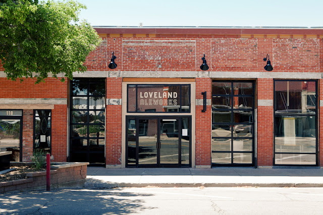
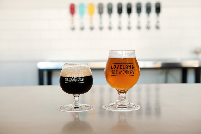
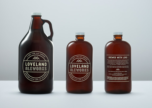
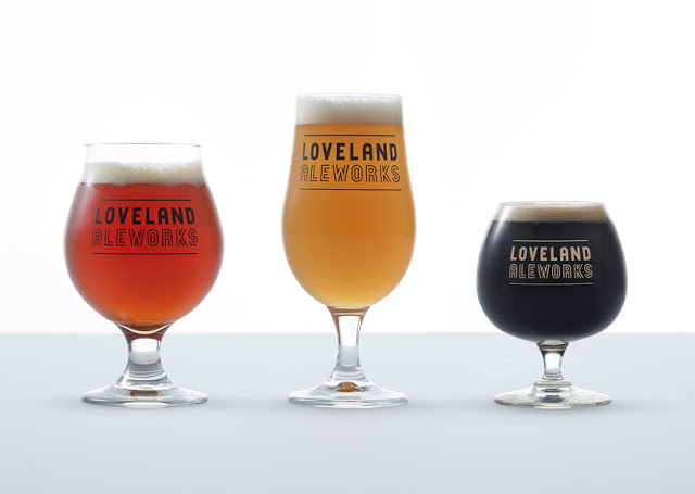
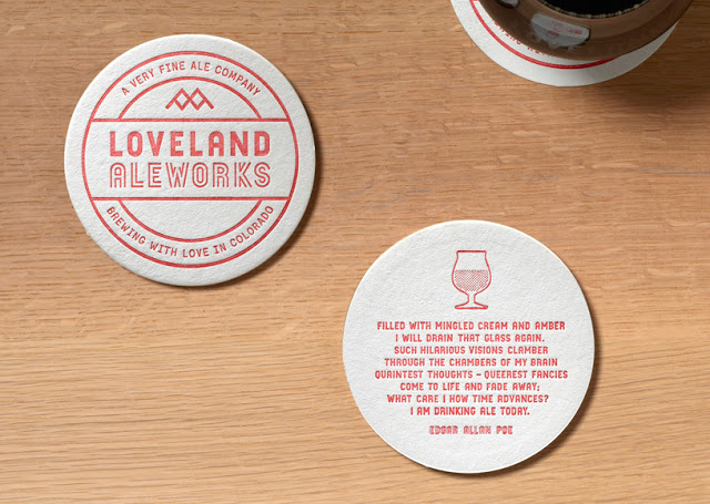
Loveland Ale Works is a small batch brewery inspired by European & American style brews. Through graphic design and interior design, they were able to create a cohesive vision.


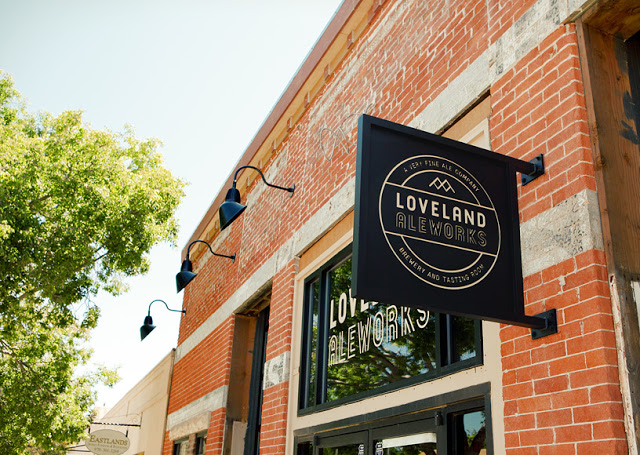
Inspired by the history of Loveland as a town founded due to the Colorado Central Railroad and gateway to Rocky Mountain National Park, they used elements throughout that play back to these ideas.


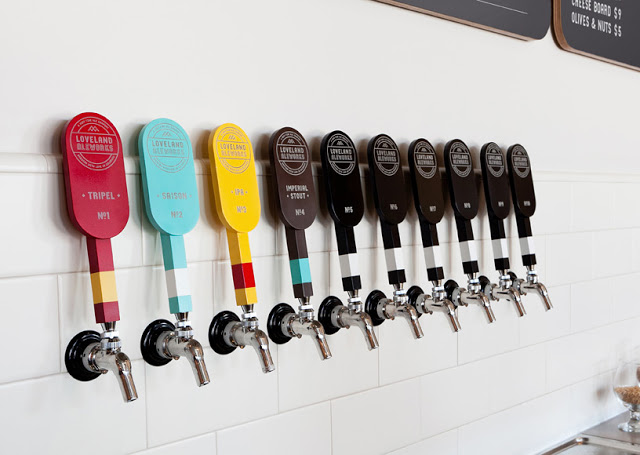
The tap handles were created based on the 19th century signal levers & the logo itself plays homage to the mountains and railway.


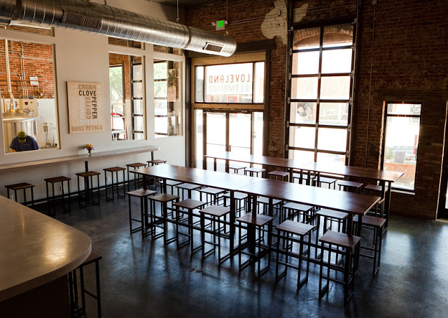
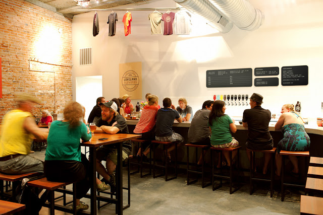
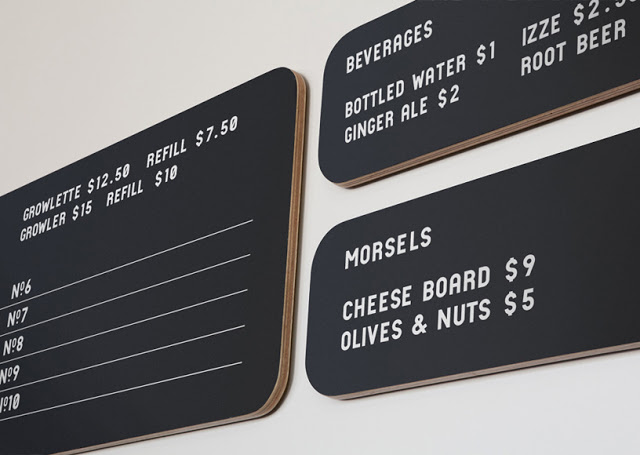
The interior was left clean and simple using raw materials to enhance the handcrafted feel. Reclaimed woods, concrete, and plywood signs all come together within the exposed brick space.


Images 1-3© Loveland Ale Works
Images 4-12 © Manual
Tags Brewery, Identity, Restaurant Design, branding, craft beer, exposed brick, handcrafted, logo, metal, wood
Comment

Lucky's Doughnuts

Kaper Design; Inspiration February 8, 2013
Name: Lucky's Doughnuts & Forty Ninth Parallel Coffee
Location: Vancouver, BC


Located in Vancouver, Forty Ninth Parallel coffee brought together two great concepts under the same, well designed roof.


Using the great bones of their raw & urban space, industrial furnishings and a large wood bar act as a rich yet neutral backdrop to fresh made doughnuts and cappuccinos.


A large, wrap around banquette and upholstered booths provide ample seating for those who flock to the new location for the onsite created doughnuts and coffee. 


The cohesive branding and logos compliment the vintage, industrial, and warm interior.


Images @ Scout Magazine & Forty Ninth Parallel

Tags Bar, Cafe, Coffee Shop, Coffee, Vancouver, doughnuts, exposed brick, graphic design, logo, teal, wood beams, wood
Comment

'wich

Kaper Design; Inspiration June 18, 2012
Name: 'wich
Location: Hong Kong
Design: Ken Lo(branding/packaging)


There is something beautifully simple when a restaurant concept comes together perfectly. When branding, logo, packaging, and interior all evoke the same message, it allows the guest a full experience.


The tongue in check name, 'wich not only speaks to their namesake concept of sandwiches, but also to the guests ability to chose.


The interior is clean, streamlined and minimalist with pops of red showing up in the seating, light cords, and gallery frames. The slate grey walls and ceiling create a cohesive warmth and allow the eye to focus on the counter and meal preparation. 


All images © Behance Network

Tags Hong kong, Restaurant Design, branding, logo, packaging, sandwich shop, small and cool
Comment

Midwest's Best; Parish Food & Goods

Kaper Design; Inspiration May 23, 2012
Name: Parish Food & Goods
Location: Atlanta, GA
Design:  B.B.Barn (branding/logo), Concentrics Hospitality

Located in Atlanta, Parish represents Southern culture and incorporates a deli, restaurant, and market all into one. With great branding, a clean logo, and a wonderful layering of southern antiques amid restored brick, this space manages to feel welcoming and warm.


Image 1,3,5 © Commarts.com
Image 2,4,6,7 @ Concentrics Restaurants
Tags Atlanta, Restaurant Design, branding, georgia, logo, southern
Comment

Cafe Luc

Kaper Design; Inspiration March 19, 2012
Name: Cafe Luc
Location: London
Branding & Graphic design: Here Design

Today comes to you with another great example of brand identity for restaurants.

 The most common element I witness clients and restauranteurs miss, is brand identity. In order to be successful you must set your space up as a unique experience. Your space must be recognizable and your message needs to be carried through throughout the diners experience. With social media growing faster every day, most customers dining experiences actually start well before they arrive at your space. Establishing your identity and message through graphic design, web design, and social media presence cannot be brushed off. Cafe Luc did a great job of translating the dining experience you will have within the space, to their identity, branding, and logo. All aspects communicate a chic, comfortable, upscale and classic vibe, take a look;


Image 1-6 © Design Work Life
Image 7-10 © Tuannhaid
Tags London, Restaurant Design, branding, graphic design, logo
2 Comments

Featured Posts

Featured
b4ba9b4dfd9de60bce32f8f1640dbab4.jpg
Aug 4, 2022
Restaurant Inspiration// Bars & Banquettes
Aug 4, 2022
Aug 4, 2022
BCSH_006_DSCF1114.jpg
Jul 29, 2022
Blue Bottle Shanghai
Jul 29, 2022
Jul 29, 2022
4C018791-0377-4F31-8BCA-EF85A2B0F990.jpeg
Jul 26, 2022
Bricklayer Brewing
Jul 26, 2022
Jul 26, 2022
Post Archive
  • Inspiration
  • Interior Design
  • Retail

Hungry for more?

Sign up for the latest & greatest design inspiration, tip + tricks, & free resources.

SPAM may be a delicacy, but you won’t get any from us.

Thank you!