Code Black Coffee

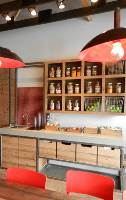
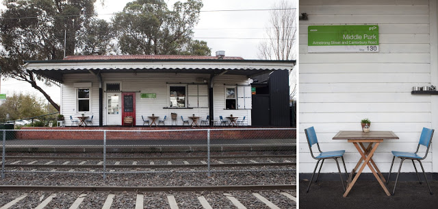
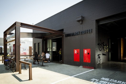
Name: Code Black Coffee
Location: Brunkswick, VIC, Australia
Design: Zwei Interiors Architecture 


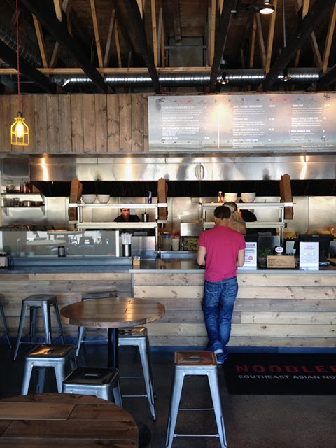
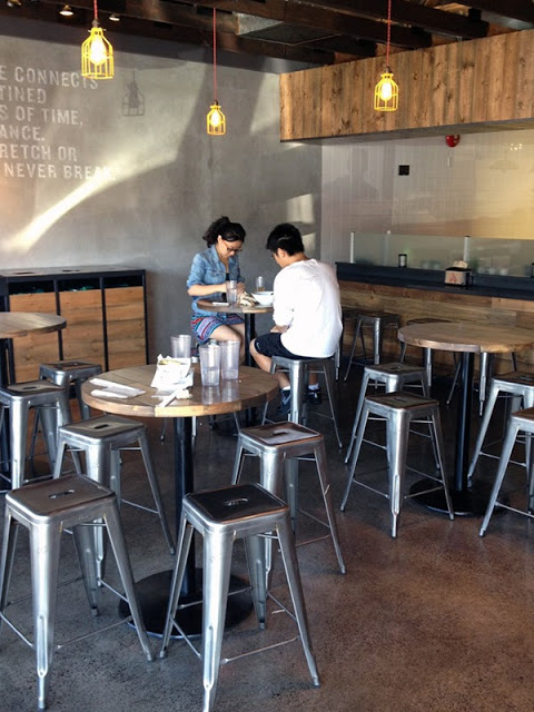
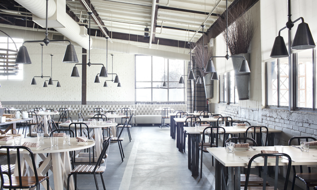
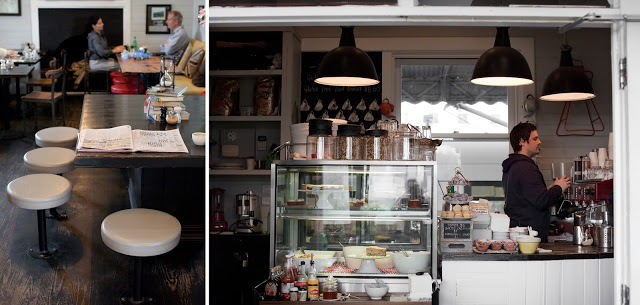
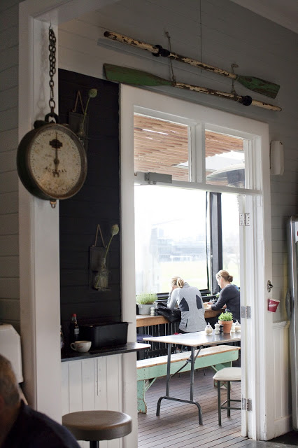
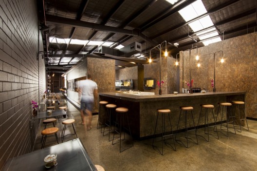
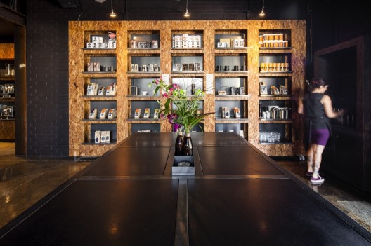
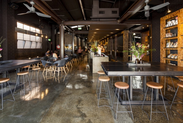
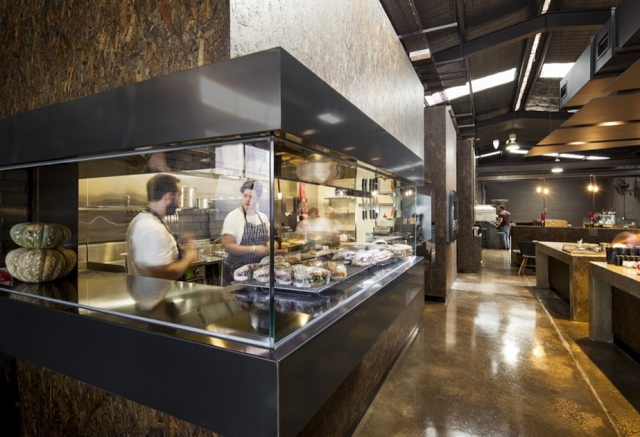
Utilizing an industrial warehouse shell, Code Black Coffee has created a raw, lab-like space that clearly demonstrates their passion for the bean. 


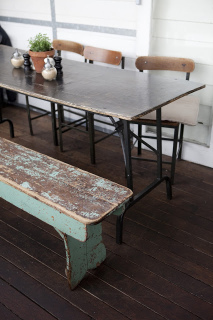
Utilizing concrete, fiberboard, steel, and brick creates an industrial and urban feel throughout the space. 


Each element within the facility, from the food preparation, coffee roasting, and serving are all clearly defined and remain open allowing guests a level of transparency into their operation. 


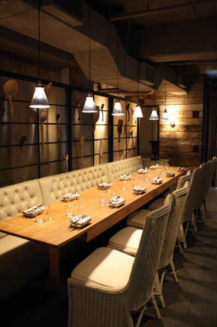
Utilizing exposed bulbs and pipes, the lighting display over the metal wall-hung tables is a great reinterpretation of the ever popular exposed bulb and pip trends. 


All photos © Michael Kai for Archdaily

Pressed Juices

Name: Pressed Juices
Location: South Yarra, Melbourne VIC
Design: Unknown


As the juice trend continues to expand throughout the world, I love seeing these shops & cafes step up their interior. Creating an environment that matches the product being sold is critical in the food industry today and Pressed Juices created a space fitting with their brand. 


The minimal color and material palate creates a calming and cohesive space. This use of simplicity allows the vibrant colors of their product to be front and center. 


The creative use of materials provides a large visual impact, adds extra storage and display space, and drives home the hand crafted and organic feel of their company. 


Photos © Booke Holm for Share Design

The East Pole

Name: The East Pole
Location: New York, NY
Design: Phil Winser

Intimate and warm, the interior of The East Pole is both industrial and nautical in a way that is neither themed or blatantly apparent. 


The low ceilings add to the intimate nature of the space giving it an almost vessel-like feeling that works well with the nautical touches. 


Using walnut, marble and black iron gives the space a classic feel allowing it to be polished with subtle industrial and nautical notes. 


All photos © The East Pole


Noodlebox

Name: Noodlebox
Location: Shelbourne Victoria, BC
Design: Evoke


For a large chain, Noodlebox has done a great job re-imagining their brand. Using a limited color palate, custom fixtures, and a heavy hand of wood, the space is a balance of rustic and modern.


Whether their intention or not, keeping the material and color palate limited allows them to replicate the design easily no matter the location or space size. 
I love that they exposed the ceilings and created harmony throughout by carrying through wood as the main material. The contrast of concrete and steel adds a modern touch and keeps the space hip and on trend. 


All photos © Evoke


Rawduck

Name: Rawduck
Location: Hackney, London
Design: Unknown

Rawduck, the sister restaurant to London's widely known Ducksoup, is delightfully raw and simple. The wonderful use of concrete and metal come together to create a space that is open and fresh.  


With a clean and fresh interior, Rawduck has created a slight spin on the very popular industrial interior. Simple materials, clean lines, and unpretentious execution all foster a fresh, raw space. 


I love the poured concrete bar and tables, as it is a material I believe too often overlooked. It's versatility  and rich texture add a wonderful feel to the space, while the scalloped/crimped edge along the bar is a great example of the level of detail you can easily achieve. 


Photos © We heart Co

Abattoir

Name: Abattoir
Location: Atlanta, GA
Design: Unknown


With a name French for 'slaughterhouse', Abattoir did a great job providing an interior that contrasts it's name while simultaneously providing nods to the spaces meat packing past. 


Warm and industrial, the interior kept it's existing brick structure relatively intact, hiding it only by a neutral coat of paint. Within the space, the bar is defined by worn wood partitions, curtains, and colorful barstools. 


The relatively raw main dining space beckons back to its meat packing days while it's neutral and industrial palate to allow the space to firmly establish itself in the present. 


Photos 1,3,5 © Sarah Dorio
Photos 2,4,6 @ Thrillist

Cafe Plenty

Name: Cafe Plenty
Location: Toronto, ON
Design: II BY IV DESIGN


Cafe Plenty uses a neutral color palate, natural materials, and graphic design to create a memorable and fresh cafe interior. 


While limited in color, there are no shortage of rich details and textures that add warmth and depth to the interior. 


Layering beveled edge tile, breadboard, rustic wood, and metal creates a welcoming environment that remains fresh, open, and bright. 


Utilizing creative graphic design and signage, the windows keep views into the space open while clearly telling those passing what lies behind the glass. 


Utilizing natural materials highlights the natural food and beverage offerings while custom bar height counters keeps the narrow space open and traffic flowing through. 


All photos © A.R.E Design Awards


J.G. Domestic

Name: J.G. Domestic
Location: Philadelphia, PA
Design: Unknown


J.G. Domestic, another space from well known chef and restauranteur Jose Garces, is the definition of modern farmhouse. Rustic timber sits alongside lush foliage and modern lines to create an updated take on tradition. 


Plaid fabric covers, reclaimed wood, and steel all work together giving the traditional farmhouse/rustic feeling. 


While the openness, clean lines, and simplicity all add the touch of modern that takes the concept toward trendy and now. 


Photos © J.G. Domestic & Ahra Lee


Mart 130

Name: Mart 130
Location: Melbourne, Australia
Photography: Erika Hildegard Photography (If you are in Australia, I encourage you to check out her amazing range of work.)


Mart 130 has to be one of the best examples I've seen recently of a comfortable and established cafe maintaining a well curated interior. When Erika's images landed in my inbox I couldn't help but get excited. Rarely do you find the blend of well loved antiques that is also still pulled together and edited. 


Using vintage and antique pieces, paired with a nautical and industrial undercurrent, Mart 130 creates a cohesive blend of worn comfort and bright openness. 


Utilizing red, aqua, black, and blue throughout the multiple seating areas ties the entire space together without needing to match everything. This allows the space to remain cohesive while each room still maintains it's own identity. 


I love the bright back patio featuring painted, dark wood and slat ceiling, you could easily sit for hours.