Mile End Sandwich & Delicatessen

Name: Mile End Sandwich & Delicatessen
Location: New York

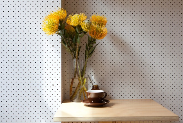
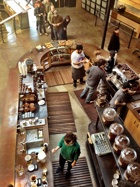
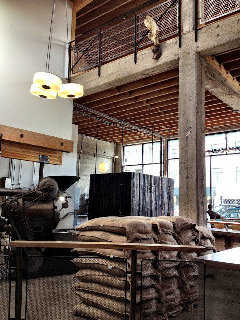
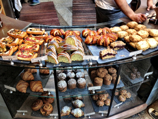
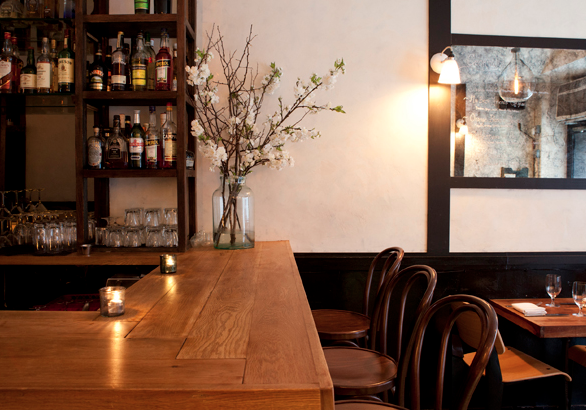
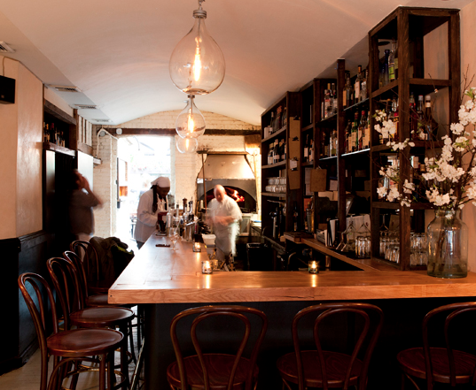
Mile End started out as a local Jewish Deli but has recently added on a sandwich shop crafted with quality design. Playing on the materials already used in the original deli; white tile, blonde wood, and a minimal color palate, the Sandwich Shop incorporates and reimagines them. Giving the spaces a similar and harmonious feel while maintaining separate identities for each. The geometric bling wood table running through the center of the Sandwich shop creates visual interest and traffic flow, while also maximizing seating. Let's take a look;

First, the Sandwich Shop.


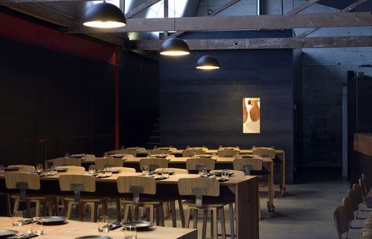
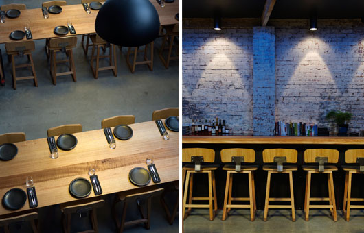
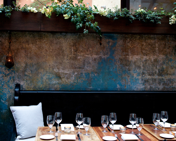
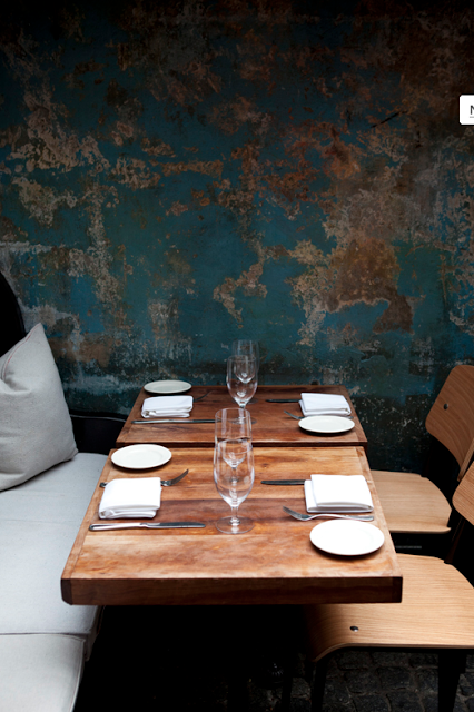
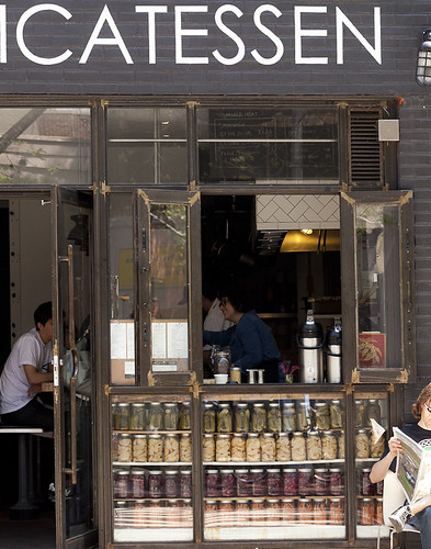
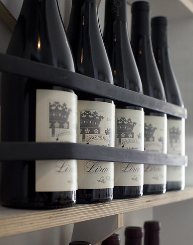
And, the Delicatessen.

Mile End Delicatessen - Brooklyn, NY

Mile End Delicatessen - Brooklyn, NY

Mile End Delicatessen - Brooklyn, NY


Image 1-3© Eater NY
Image 4- 6© Eric Isaac via Snapfo

West Egg Cafe

Name: West Egg Cafe
Location: Atlanta, GA
Design: Square Feet Studio


What catches my eye about West Egg Cafe, located in the heart of Atlanta, is it's simplicity and authenticity. In design, simplicity always seems like it would be the easiest element to achieve when in reality, it's one of the hardest. Keeping a minimal palate and limited materials drives you to analyze each components location, use, and function in the larger picture. Creating a space that is functional, efficient, and cohesive while avoiding the sparse, under-developed feeling traditionally associated with simplicity and minimalism, is a true test. West Egg Cafe accomplished this simplicity and still managed to create a visually interesting, functional, and inviting space.


All photos © square feet studio


Tiny Cafe

Name: Tiny Cafe
Location: Australia
Design: Foolscap Studio


At under 150SF, this cafe packs everything in while managing to keep the space clean, cohesive, and fun.  With a kitchen, coffee machine and seating for 12 all located under a set of stairs ins hat used to be an old laundry cupboard, Tiny used space saving solutions like folding down tables and a simple color palate to keep the space focused and efficient.


Tiny Cafe Sections

All images © Foolscap

Baker D.Chirico

Name: Baker D. Chirico
Location: Australia
Design: March Studio
Branding/Logo: Fabio Ongarato Design

At the office, we swoon anytime we see a great, cohesive concept. Baker D. Chirico nailed it. Keeping the palate clean and limiting it's colors to black, white, and blonde keeps the interior space and branding fresh and allows for a juxtaposition between tradition and modern. Allowing the bread storage to be an architectural and sculptural fixture gives the space a feeling of the unexpected and keeps the concept unique.


Baker D. Chirico brand identity

Baker D. Chirico brand identity

Baker D. Chirico brand identity

All photos © ID via Peter Bernnetts

Garagistes

Name: Garagistes
Location: Hobart, Tasmania
Design: Paul Johnson (architect) & Kirk Richardson (owner)


This minimal warehouse space is a great example of a well though through concept. At first glance, the simple community tables, exposed beams and brick walls evoke a clean and styled space. Knowing all elements were made locally by local artisans, weaves a unique texture into the design. With the all of the food coming from four local vendors, the idea of local and sustainable was taken to a whole new level. Keeping with this idea, you can understand how sourcing all of the furniture and fittings from local craftsmen(even their dishes are created from local clay and glazes) keeps their vision and concept strong and cohesive.


Image 1-3 © Habitus Living

Sight Glass


Name: Sight Glass
Location: San Francisco

My love for coffee and well designed coffee shops can easily be traced back to San Francisco. With new shops and roasters opening up daily, the coffee scene there is exciting and second to none. The coffee scene in Chicago could use a little work. With everyone brewing Metropolis or Intelligentisia, it's been refreshing to see Stumptown, Bow & Truss, and La Colombe enter the mix but it still lacks the local, small batch roasting you see everywhere out West. Sight Glass is just one of the many well designed roasters opening up all around SF and the interior is just as beautiful as their art. With a double story space outfitted with exposed wood beams, metal stools, and curved coffee bar, the space is industrial, warm and exciting.


Large tables, exposed beams and even light from skylights make the second floor a comfortable place for a cup of coffee. Sightglass Coffee company took the interior of a nondescript warehouse on 7th Street in San Francisco, Calif. and reinvented it with interlocking levels and renovations.


Photo 3 © Inside Scoop SF
Photos 1,2,4 © The Cabinet Shop
Photos 5-6 © Brewly Noted

August

Name: August
Location: New York

August is a lesson in rustic. Wide plank wood and cobblestone floors meet distressed walls peeling with layers of blues and greens. The entire space gives off a warm glow and feels entirely comfortable and rooted. The greenhouse like space located in the back of the restaurant makes you feel like you could be anywhere but NYC, creating an intimate experience and beckoning you to stay a while.


All images © August

Boqueria

Name: Boqueria
Location: SoHo, NYC


Inspired by the tapas bars of Barcelona, Boqueria is designed to provide the best tapas and late night dining. Utilizing fresh, local ingredients the space feels like a well primed canvas for the color infused nightly. With banquettes wrapping an entire wall and large, central community table, the space feels streamlined, clean, inviting, and warm. A neutral backdrop with textural depth, the place creates an inviting and timeless atmosphere.


All photos © Meyer Davis Studio

The Dandelion Pub

Name: The Dandelion Pub
Location: Philadelphia

Designed as a take on the London gastropub, I certainly hadn't expected for the The Dandelion Pub to be located in philadelphia! A bit quirky and layered with warmth and texture, the interior looks as if it's been in Philadelphia for centuries. I love the tufted banquettes and moulding and while I'm not typically a few of tchotchkes, the deign of this space fits the desired direction and vision. It looks well thought through and every element seems to make sense within the parameters of the concept.


Delaunay


Name: Delaunay
Location: London


Reminiscent of a mens club in all its grandeur of the 1920/30's, Delaunay seems to transport you back in time. The rich woods, leather and accents of gold & brass, all add a richness and depth to this elegant space. What I love most about this design is that it actually feels as if it could be an institution, a place your grandfather may have gone for a drink. What one might not expect is that Delaunay is only a few months old. The styling, material use, and even menu all speak of another era perfectly.


intimate seating, booth seating, low-level lighting, paintings

delaunay counter, take-away, green bicycle with basket of bread


Image 1-3 © Travel Modus
Image 4-5 © Remodelista