RN74


Name: RN74
Location: San Francisco, CA
Designer: AvroKO

Named after the Route National 74, which runs through the 'Burgundy wine region of France' this San Francisco restaurant (opened in 2009) was styled after a french train station. The most direct nod to this is the vintage arrival/departure board, which features the nightly wine selection and prices.
Having watched this space get built from the ground up, I appreciate the design knowing its location and proximity to the new (& former) Transbay Terminal. The urban simplicity and almost rustic elegance of the space allows the guest to experience a wonderful meal in an environment that truly represents the diversity of the Burgundy area.


Full Dining Room with Trainboard

best-san-francisco-restaurants-07.jpg
 Image 1 © sfgate.com
Image 2&3 © RN74


The Smile

Name: The Smile
Location: NYC, NY

Located in Noho, what I love about this space is it's contrast to it's environment. Designed as part coffee shop/ part general store, it has a rustic charm to it with a slight urban, industrial feel. It looks like a great place t grab a cup of coffee on a chilly winter morning.


All photos © New york Magazine

The Power of Branding in Restaurants

One over-looked element of restaurant design (that just happens to be one of my favorite parts of the process) is branding. Typography, color, lines, graphics and patterns. The process of creating an identity for a space follows much of the same process as interior design. Branding and graphic design can elevate a design and turn a great design into a show-stopper. Here are a few examples of branding and graphic design done well in the restaurant environment.

The National, NYC


The Barn, Berkinshire (via. & via.)


The Red Canoe, Brooklyn (via. & via.)
  

And Lastly, you might remember Capital Kitchen from an earlier post I did on their interior. Here is the branding that goes along with their amazing interior. (via.)


ABC Kitchen, NYC

Name: ABC Kitchen
Location: New York City

Located in the ABC Carpet & Home store lies a beautiful space to take a break from shopping and grab a delicious, and mostly local, bite to eat. The space exudes a dress-up country feel and strikes a wonderful balance between clean, cool, rustic and industrial. I love the mix of wood tones and metal based tables with modern white chairs and tilted chandeliers. Place this in a wonderful urban/industrial setting with stunning raw wood beams and you have a space that will appeal to the masses. 


Girl & the Goat

Name: Girl & the Goat
Location: Chicago, IL
Designer: Karen Herold- 555

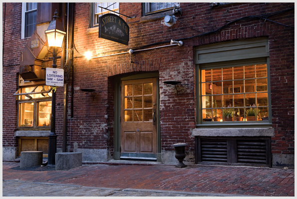
I have been saving this post for quite a while. This is mostly because it was a great local location, run by Top Chef winner Stephanie Izard and I knew I couldn't do the space justice without visiting first. I finally got that chance a couple weeks back when I decided to buckle down and get my bum over there for my wedding anniversary!

The space did not disappoint.

It took me a while to even look at the menu 
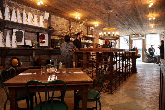
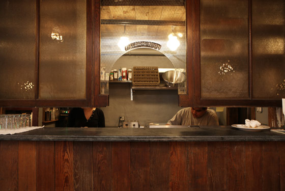
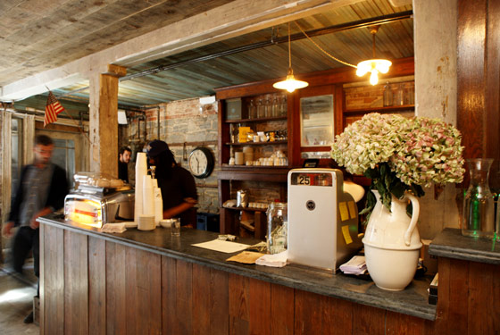
(which was beyond excellent, again no surprise there!) I was so engrossed in the details surrounding me. We were sat in an intimate booth next to the surprisingly beautiful, burnt wood partition wall in the center of the space. With a great view of both the bar and the kitchen, it was easy to see why Girl & the Goat was so successful. The attention to detail and division of space are what brought the design home for me. There were many zones for seating which allowed diners to enjoy a relaxed and intimate meal despite how large the space actually is. Detail such as the metal grates on the bar and the intricate inlayed tile under the community table also brought warmth and character into the space.

Here are a few of my favorite moments:


Overall, the space felt layered, warm and inviting. The use of natural colors, wood tones and texture really brought the space to life and enhanced the beautiful open kitchen where Stephanie worked her magic.

Photo 1 © Metromix
Photos 2-4 © Anthony Tahlier via
Photo 5 © Anna Wolfson


Craving more?
Check out our website; Kaperdesign.com!

Small and Cool: Doughnut Vault

Name: Doughnut Vault
Location: Chicago, IL

Located through a tiny blue doorway, on a side street near the merchandise mart, lies a doughnut shop that makes the most delectable, fluffy clouds of dough. The interior is tiny, no more than 4 people can fit inside at a time but that doesn't stop the line from forming an hour before they open. The interior is clad is original and exposed brick, tilted fixtures and mirrors, a beautifully ornate vintage cash register and stunning distressed blue woodwork.


 I don't typically show up on the blog, but this sign was far to awesome not to be included.


 This girl is seriously amazing, she is there all the time and handles the crazy line and non-caffinated chicagoans by herself and with a smile.

All photos © KaperDesign

Stop by the new website at kaperdesign.com and say hello!

Avec, revisited

Name: Avec
Location: Chicago
Designer: Thomas Schlesser

You may remember my initial post about local Chicago favorites; Avec & Blackbird. While I love to post great designs, whether we have been there or not, it is always a fabulous treat to experience the design first hand. This is exactly what I had the chance to do a while back when I was invited by two kick-ass girls I had the privilege of working with while at Nate Berkus Associates.

The interior is great. It is simple, clean and unfussy. The best part, besides the food, was the heath ceramics it was served on. The only design update that was unfavorable, the layout. For the tight space they did a great job maximizing space and figuring out how to seat as many people possible while still allowing servers to come by with food. Unfortunately the entry area was a bit too tight and made for a very awkward and constantly shifting, wait for out table. Overall the experience was extremely enjoyable and the food was amazing, I can't wait to go back!


Image via Avec/Blackbird

East End Cupcakes

Location: Portland, Maine

All too often we see local restaurants, cafes and bars, fail at the design of their space. While the food/drink might be great, the first impression can barely get us in the door. At Kaper design we understand that many mom-and-pop-type shops don't have much extra funding after purchasing the space, hiring employees, and ordering the equipment. But, we believe that that is no excuse for a lacking interior environment. So as you can assume, we get pretty geeked when we see a small shop that not only has a great product, but also has a wonderful interior!
While in Maine last week, we spotted just such place. Take a look: 


 If you go, be sure to try their chocolate/ pb cupcake with sea salt on top. It was amazing!


Visit our website at kaperdesign.com

Portland, Maine


As a self-declared foodie (Lucky for me it's also part of my job description!), one of my favorite things to do is explore restaurants and local food. One of the most overlooked and underrated, in my opinion, foodie location is Portland, Maine. It's hard not to be when you are located inches away from multiple harbors where fresh seafood flows in hourly.

Add to that the cobblestone streets, brick buildings and down-to-earth vibe and you have an area overflowing with great places to eat. The charm of most of the places in Portland is the we've been here forever, hole-in-the-wall feel. 

Rob Evans, the local celebrity chef has recently brought some light to the area when he won a James Beard Award in 2009 for his restaurant, Hugo's (Another JBA was won in 2002 for Fore Street & it's chef). Yet, even with this recent addition of a JBA, Portland is still overlooked. With that, I want to present you with a few local food favorites from this amazing city.

Street and; Co.


Five Fifty-five


Duck Fat


The Porthole Restaurant


Sebago Brewing Company

Babylonstoren

Location: Drakenstein Valley( Located in the heart of the Cape Winelands about 45min. north of Cape Town, South Africa)

I have wanted to go to South Africa for as long as I can remember. Stumbling across this small vacation property and large farm re-lit the fire inside me. Take a look at the photos below and I'm sure you will see why.

The property is a 17th century Dutch(!love it, obviously) farmyard that was built in the Cape Dutch Tradition. The Cape Dutch style typically includes white-washed stone or brick walls,  thatched roofs and ornate gables. The property features a large farm and guests can enjoy picking their own salads, guided tours through the farm, or a meal at the properties restaurant where they use the materials grown on site.

The simplicity and pureness of the area draws me in and I adore the graphic tile wall in the restaurant where the daily menu is written.
 
The suites are also beautiful and feature small kitchens where you can prepare your own meals, using fruits and vegetables you picked right outside your door.

All photos copyright Babylonstoren